Overview
Deimos strongly dislikes how the new Firefox address / location bar (also known as the awesome bar) behaves and would like share a fix for it.
Download oldbar – Firefox Add-ons
Download the following Firefox Add-On to make the Firefox 3 Address Bar function in a manner similar to Firefox 2 Address Bar. Made for those who dislike Firefox 3 Address Bar.
https://addons.mozilla.org/en-US/firefox/addon/6227
Firefox 3 Address Bar – Before installing oldbar

This is how the new Firefox 3 address bar looks like, showing both the title of the page as well as the url, in which Deimos thinks is totally unnecessary. Only the url should be shown, the page title is totally not needed, and causes much eye sore.
Firefox 3 Address Bar – After installing oldbar

After the installation of the oldbar add-on, the page title is no longer shown, much better.
Firefox 3 Address Bar – about:config

You might also want to tweak some settings by typing about:config in the address bar.
Firefox 3 Address Bar – urlbar

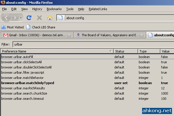
Type urlbar in the filter and you will see the above, set browser.urlbar.matchOnlyTyped to true and you will get much less results when you use the Firefox 3 address bar.
Deimos’s Daily Reads
A thorough guide about keywords, search engines and content – by Marcus Hochstadt.
Deimos’s Thoughts
Luckily, there is an oldbar add-on, as Deimos really dislike the new Firefox address bar.
Deimos Asks
Installed Firefox 3 yet? Do you love or hate the Firefox 3 Address Bar?


4:25 am
elezend
said the following:
On the other hand, I really like the new address bar 😳
Very convenient for me when I forget the address and remember what it was about 😀
6:42 am
Michael Aulia
said the following:
I used to be like you, Deimos, hating the new bar. I decided to just give it a try for a few weeks. I now can leave the old one 🙂
In fact, with the new bar, you can simply type the keywords! So for example to go to your entrecard inbox (http://entrecard.com/user/%5Byour user number]/inbox, you can simple type “entre inbox” or “inbox” and the URL will appear! Much better than the old one!
10:16 am
Deimos Tel`Arin
said the following:
@elezend:
Me no like it. Methinks it is an eyesore! ➡
=======================================================================
@Michael Aulia:
Old one is functional, new one has shiny features but messes everything up. 😥
=======================================================================
1:04 pm
elezend
said the following:
Me loves it because I’ve gotten used to using it 😀
Now, you ask me use IE; I will get headache cause the address won’t display the history straight after typing some keywords ➡
1:14 pm
kljs
said the following:
I have been using the awesome bar since it’s development phase during all the alpha, beta and RC stages. At first, I can’t get used to it. However, since I always only use development builds of firefox, I had to use it. And the longer I use, the better it gets. Now, if you give me the old bar, I will be wishing for the new one, since it has some nice features. Like if you type something in the bar, it will show you the most relevant urls that you had access. I like it, as I surf lots of website/blogs/forum, I can’t fit most of it into my bookmark bar, so the awesome bar helps.
Try it for a while longer……… don’t dismissed it until you try all the features of the awesome bar……
1:26 pm
BaseGuardian
said the following:
I like the new version,
made my life easier 😆
2:20 pm
dicky
said the following:
I like this new feature because it can automatic complete the address bar for us. For example, if you type “hko”, it will search for all URL which contains “hko”. But i hate the new address bar because it contains 2 lines, which annoy me.
So, i would prefer old (Firefox 2 ) address bar with “autocomplete manager” plugin. Haha…
3:36 pm
kljs
said the following:
I totally the two lines thing. As it shows the URL…….. together with the title. Another aspect of awesome bar is the security features. Try logging into paypal and you will see the security thingy at work…
7:13 pm
Deimos Tel`Arin
said the following:
@elezend:
I hate it. Not gonna get used to it.
@kljs:
I like the search features, hate the extra page title.
@BaseGuardian:
I hate it! Made my eyes suffer!
@dicky:
Exactly my thoughts! Did you read my mind?
@kljs:
I just hate the 2 lines thingie, the rest are pretty awesome actually.
7:14 pm
elezend
said the following:
@dicky I personally find the two lines convenient because sometimes I remember part of the url and sometimes part of the site’s title so 😛
7:17 pm
Deimos Tel`Arin
said the following:
@elezend:
It would be nice the 2 line thingie can be turned on and off via shortcut key.
7:54 pm
Marcus Hochstadt
said the following:
Great you like my article, Deimos. 😎
I also dislike the new 2-line address bar right from the beginning; find it kind of distracting. But as I also dislike using tons of add-on’s (the only one I currently use is SearchStatus), I decided to give it a shot and see what happens; eventually close my eyes while I type in a URL… 😉
~Marcus
8:14 pm
Deimos Tel`Arin
said the following:
@Marcus Hochstadt:
It is a good article. 🙂
2 lines is bloody annoying! 😥
Thank goodness there is this add-on for us! 😯
9:33 pm
ameo
said the following:
loved it . that addon is really good although i don’t use firefox as much as i used to but i did hated the new addressbar .
BTW in the first screenshot . 10036 message !! :O
you must be busy busy 😉
9:37 pm
Deimos Tel`Arin
said the following:
Ah, you be a hardcore Opera user instead. 😎
Not busy with emails la, that happens if you run a RSS exchange program. 😛
10:01 pm
elezend
said the following:
RSS email exchange program? 😯
I have enough headache clearing google alerts in my gmail that’s why I always use google reader for RSS =)
10:23 pm
Watch Friends Online
said the following:
Great Article …I also dislike the address bar but firefox should have some changes for its version 3 and so I believe that they are having such a thing…Hope it doesnot cause much problem!!
10:53 pm
ameo
said the following:
Man .. Rss Exchange , i never subscribe to any thing through mail .
call me paranoid but i like my mail for just mail
and some how i look at rss as spam . [ you know what i mean ]
i used opera feed reader and it works just fine with me it handle over 140 feed perfectly .
10:59 pm
Nicole Price
said the following:
I am perfectly happy with the new version. I suppose that each has her or his own preferences and special needs.
11:44 pm
levian
said the following:
i find the “awesome bar” confusing.
ever since i installed my new firefox,
i had been ignoring it
(only paid attention to the big title thingy).
😆
11:39 am
Orange
said the following:
i like firefox 3 because of the new looks like smooth scroll tabs and sleek back button but thats just me..
6:52 pm
Djyano
said the following:
At first i got annoyed by this, but after a while i get used to it.
11:27 pm
dicky
said the following:
I could be better if we can toggle the 2 line on or off using shortcut keys, or let us decide the line height. The third suggestion is allow user to combine them into one line, and use color to differentiate between title and URL.
10:29 am
Anon Emouse
said the following:
There been a huge movement to waste screen real estate the past 5 years. Like it or hate the main point is why in the F@#$% isn’t there an easy-to-find granular properly-named option to put it back to one line. Nothing like a hardcoded interface to break years of user familiarity.